
A popular dish in Korean cuisine is bibimbap (bibim means “mix” and bap means “rice”). It is a dish of rice, vegetables, meat, and egg. The vegetables and meat are stir-fried and arranged in individual circles on a bed of steamed rice. The fried egg is placed on top. When eaten, diners will mix everything together, sometimes adding chili or the many side dishes that accompanies a Korean meal.
Bibimbap is emblematic of many Korean dishes, in the sense that it consists of a staple (in this case, rice), that is mixed with other main ingredients and is served with a multitude of side dishes. It is one of my favorite foods, but I have never made it myself. This changed last Friday, when I took a bibimbap cooking class together with other artists at the Food and Culture Academy Korea.
The similarities of bibimbap and design nagged me throughout the process, from preparation to consumption. For me, Korean cuisine is quite an apt metaphor for many steps in design, both from the perspectives of the designer and the consumer.
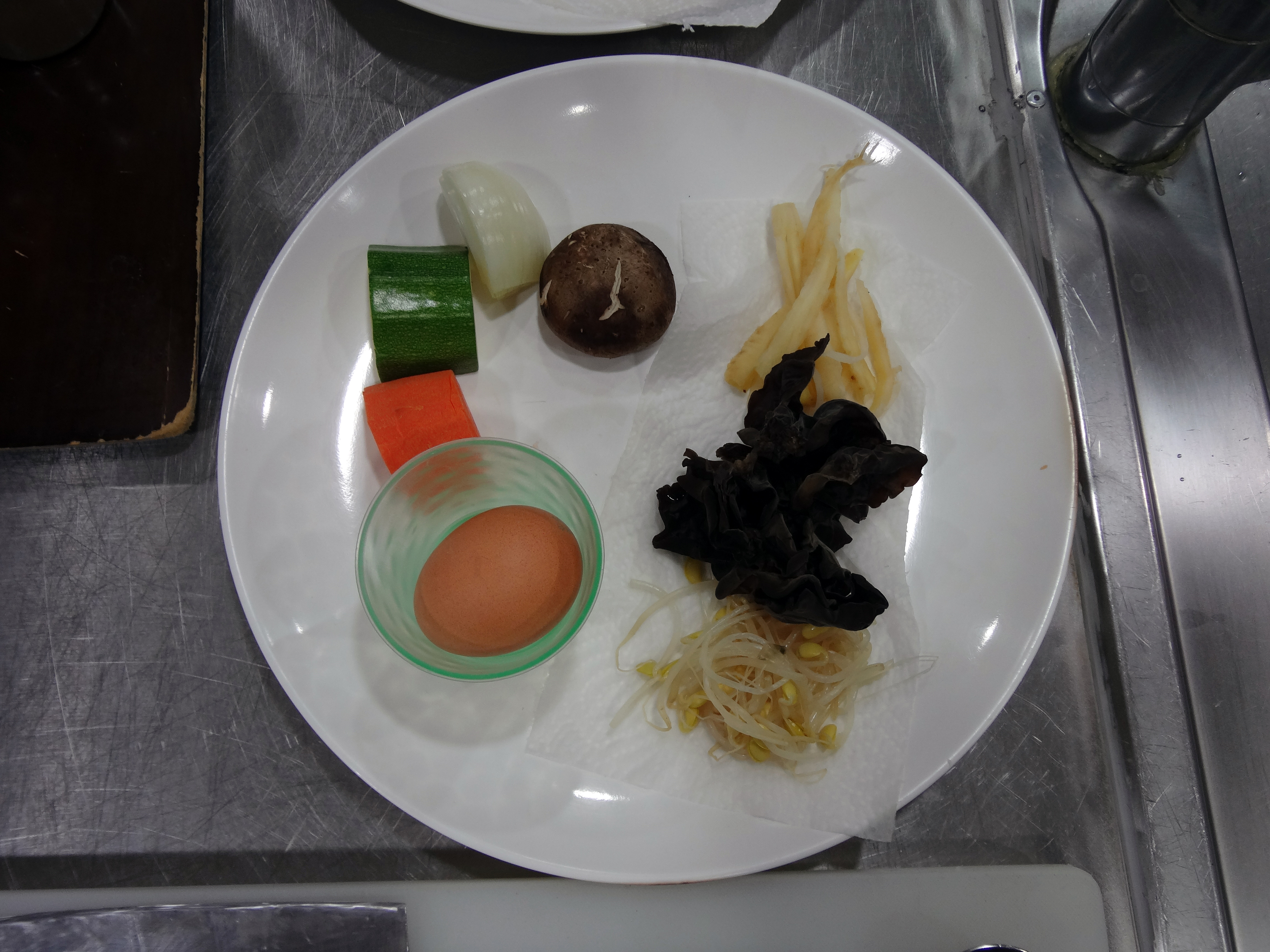
basic bibimbap ingredients
Preparation: Bibimbap and Design from a Chef’s Perspective
1. Simplicity
The ingredients in Korean cuisine are very simple. In a basic bibimbap dish, there are bean sprouts, carrots, zucchini, mushrooms, onions, doraji (a Korean root crop) and an egg. (A little bit of beef is given to meat-eaters, but not for me; I’m pescetarian.) For me, the best products and experiences are those with few features.
2. Purpose
The ingredients in bibimbap all have a function. Their number and colors are important as well. The nutritional value of the food matters as much as the presentation of the dish. In comparison, the best products and experiences are those whose building blocks and functions are clearly articulated. Each piece has a purpose, and those pieces that do not are removed from the final design.
Consumption: Bibimbap and Design from a Diner’s Perspective
3. Flexibility
Korean cuisine is a visual feast. Unlike Western meals where main courses are served one after the other, everything is served together in a Korean meal. Rice and soup are always at the center of each diner’s place setting, with the side dishes surrounding them. As Korea started out as an agricultural society, all meals are designed to complement rice. Thus, diners can design their own meal to customize their tastes. This framework allows for a wide range of flexibility. One can order bibimbap every night in the same restaurant, yet his experience of the dish will always be different. Similarly, my favorite products and services adjust to my situation. Each encounter with them gives me a different experience. A smartphone enables me to call, send an SMS, take a photo, share a video with a friend, or download a file from an email, depending on my needs.
4. Recovery
Korean cuisine allows for each diner to recover from his “mistakes”. If he eats something too spicy, he can eat a side dish that is a bit more bland. If he is tired of a particular texture, he can move on to something else. The diner is given control of his experience. Moreover, while the chef of a Korean meal may not know of the diner’s tolerance for certain flavors, he gives the diner solutions in the form of complementary side dishes that allow him to compensate. This is in contrast to most Western meals where the diner has to focus on each course and, if he is unsatisfied, just wait for the next one. In design, my favorite products and services give me ways to rectify unpleasant situations. An email service can automatically send spam to a folder, delete viruses before they affect me, allow me to label messages so I can have a more orderly inbox, and so on.
But enough academic musing. Behold, my first (and hopefully not last) bowl of bibimbap I cooked myself:
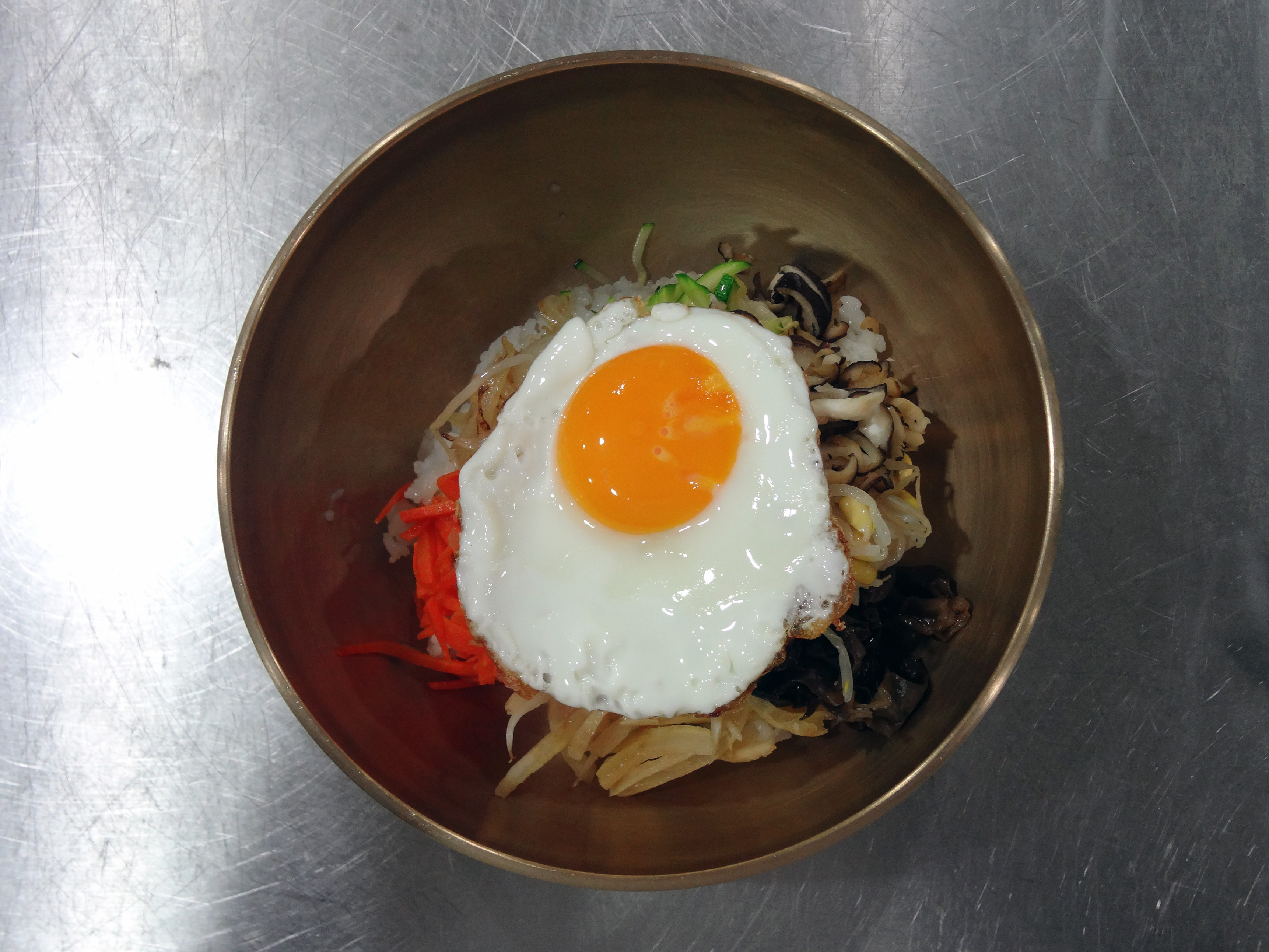
The first bowl of bibimbap I have ever made in my life.
I feel proud. Even though all I did was slice and stir-fry.
With thanks to the staff of the National Art Studio, Changdong and the Food and Culture Academy Korea!


")


")


