La Monja Loca: Crazy Nuns, Cornettes, and Clockwork Orange Eyes
In the middle of art/science projects, I do say yes to doing graphic design, especially for awesome people. Creatively speaking, it’s a good break from the grind and practically speaking, it’s good to know that I can still do things like logos.
So this is a logo design project for a shop called La Monja Loca.
Yes, The Crazy Nun.
It’s the gift shop of Carlos Celdran. You may have gone on his tour. You may have seen the headlines. You may have seen him with his iconic top hat.
Years ago, I designed the logo for his Intramuros tours. Yes, it’s a top hat. And if you’ve received his Intramuros poster, yes, I designed that, too, many, many moons ago. Fun, fun project.
So. La Monja Loca. The brief given to me by Ria, the project manager / producer, was to generate an iconic crazy nun with one eye that was a cross between Clockwork Orange and Twiggy’s spiky eyelashes. In the beginning, I sketched out variations of eyes.
 Version #9 was chosen. I also did some research on the wimples that Carlos wanted. These are called “cornettes.” (Hey, I didn’t know that! Now I do.)
The fourth one was the one they picked. I tried sketching out three different poses. First was one facing right (viewer’s angle). It was a bit too Clockwork Orange.
I sketched another version facing left.
Finally, I sketched a frontal symmetrical version, which was ultimately chosen. I like that version best, too.
They also liked the script lettering from the second version. It fits because a lot of script calligraphy fonts recall the late eighteenth century and early nineteenth century, which is the time period that the store evokes.
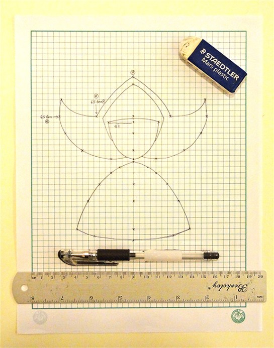
To make sure things are symmetrical, I sketched the nun on graph paper. I always feel more connected with my work when I first draw them.
Afterwards, Carlos wanted the wingtips flattened so as not to resemble horns. He also took out the bib. I gave him a number of time-appropriate script fonts to choose from and he chose Flemish Script. I then worked to make the resulting logo a bit older, “inkier” and less sharp to match the period. Carlos, Ria, and Tesa Celdran offered feedback last weekend. And voila, here we go:
Next time you’re passing through the Walled City of Manila, do check out the store! It’s located at the Plaza San Luis, Calle Real, Intramuros, Manila. Follow the store’s Tumblr here.
This project made me think of all the logos I’ve ever made. Check them out here. *tears*
Ok, now back to my regular sketching and prototyping and making grind.


