Archive

Art

(Seoul)—Last Saturday, a group of high school students from the docent program of the National Museum of Contemporary Art of Korea made their way over to the Changdong Art Studio for a talk and workshop with me and fellow artist-in-residence, Karolina Bregula.

Ms. Sung-hee Cho of the NMCA Korea's Department of Education & Residency Program

Ms. Sung-hee Cho of the NMCA Korea’s Department of Education & Residency Program

After I made the students go on a scavenger hunt in my studio, we had homemade kimbap and tteokbokki for lunch. Then, I facilitated short workshops on drawing what they see in clouds, assigning colors to memories, and a blind smell test to dig through their memories.

There are few days when I think having a group of teenagers go through my room is a good idea. This was one of them. Such bright young ladies!

There are few days when I think having a group of teenagers go through my room is a good idea. This was one of them. Such bright young ladies!

Drawing cloud interpretations

Drawing cloud interpretations

A wall of clouds!

A wall of clouds!

Connecting color to memory

Connecting color and memory

A smell test

A smell test

For the color workshop, I thought the work of this student who matched color with pop culture was spot on:

Colors as pop culture references

Colors as pop culture references

I also loved this color palette of memories by another student:

Color and memories of places

Color and memories of places

Oh, and some used The Hug Vest as well.

The Hug Vest lives!

The Hug Vest lives!

Post-workshop cleanup wearing an apron. Ms. Cho and her assistant spent an entire day making tteokbokki for all of us. And it was great!

Post-workshop cleanup wearing an apron. Ms. Cho and her assistant spent hours making tteokbokki for all of us. And it was great!

All in all, a lovely and inspiring day with such intelligent women, who will soon be off to university.

With thanks to Ms. Sung-hee Cho of the National Museum of Contemporary Art, Korea, and the staff of the National Art Studio of Korea, Changdong. Also huge thanks to Ashlee Seo Hyung Lee, who translated for me during the day.  

In a field trip to the National Museum of Contemporary Art of Korea, I came across the piece Wol In Cheon Ji (2012) by Korean artist Choon Sup Lim in his solo exhibit, Luna, and Her Thousand Reflections.

On one side stands an enormous wooden structure that resembles a loom. The other side consists of four columns with thread.

DSC01681


Wol In Cheon Ji (2012) by Choong Sup Lim

Wol In Cheon Ji (2012) by Choong Sup Lim


In the middle lies a lovely installation of a tiny pavilion that is hovering over a changing projection of the moon’s surface.

Wol In Cheon Ji (2012) by Choong Sup Lim

Wol In Cheon Ji (2012) by Choong Sup Lim

Wol In Cheon Ji (2012) by Choong Sup Lim

Wol In Cheon Ji (2012) by Choong Sup Lim

There was something incredibly light and peaceful about this piece, which took up an entire room. So lovely! The exhibit runs until February 24, 2013.


hotteok, South Korea

hotteok, South Korea

Annyeong, everyone! I’m starting another project.

During my first three weeks in Seoul, beyond the palaces, the museums, and other beautiful attractions the city has to offer, I learned to fall in love with their street food. I have started some drawing projects over the years, and so I came up with The Movable Feast: A Street Food Project, an interpretative illustration project that celebrates the joys and oddities of street food around the world.

Inclusive cuisine

Street food is arguably the most socially inclusive, yet sometimes unnoticed or taken for granted, of all cuisines. There is neither dress code nor reservation required. Everyone has to wait their turn. Street food is among the best things to eat when one is rushing to work, taking a break in between classes, or being too lazy to cook. It is cheap, easily available, and delicious.

The menu of street food can be simple (such as coconut juice and watermelon slices) or more complex and hard-to-find (such as escargot on the go, lobster sandwiches, and grilled tamales) This system includes a range of members—from the ambling taho vendor (Philippines), the seasonal bocadillo stall (Spain), to scheduled and franchised food trucks (United States). It is a mobile and complex system that consists of the producers of raw materials, the makers of the actual dishes, the transportation and infrastructure that bring them to the venues in which they are served, the governing bodies that allow their selling, and the vendors and consumers themselves.

Globalization and diaspora

In many ways, I have discovered that street food is a symbol of globalization and diaspora. Many of them hail from other countries, but with local flavor. Consider goroke, the Korean version of the French croquette. Or hotdogs in Iceland. Or shawarma in Canada. It is also a symbol of urbanization—as the population who move from rural to urban areas increase, so does the need for alternative sources and ways of distributing food.

Street food as identity

I believe that street food is a vital part of the culture and identity of a city. It is indicative of the sustenance immediately afforded by its geography. But more than that, it is a symbol of a people’s resourcefulness, creativity, and survival. They tell us stories about ourselves.

Eating and perception

Eating street food fires up all the senses, which are the center of my larger body of work. Street food conjures up memories of childhood and gives strangers a shared experience of a meal. These drawings themselves are interpretative; more than documenting what they are, I also draw how they’ve made me feel, and write the memory I have about them.

Follow the project’s Tumblr here.

P.S. Drawings up every Monday!

P.P.S. As I am based in Seoul, many of these posts will be about Korean street food, though I will draw all the other street foods I’ve eaten in other countries, past and future. But if you wish, you can submit photos of street food from your country and I can try it out and draw it. Or submit your own drawings, following the format I’ve started. The link to submit is here.

The Movable Feast, where eating means research. Thank you for checking it out.

Scroll below for an informal giveaway!

My desk, January 2013

My desk, January 2013

Annyeong! I’m posting from my studio in Seoul, where I’m based for a while. This is my current desk. See if you can spot the following:

1. My lucky caganer
2. A bubble maker
3. A biography of Robert Irwin
4. Thaumatropes (which have been mistaken for eye masks—yes I am in Korea!)
5. My English and Chinese names translated in Korean
6. Receipts, mostly from Etude House
7. A Post-It pad shaped like a heart
8. Chinese astrology for 2013 (I found it on the back of my bus ticket, which I found interesting.)
9. Something from SVA IxD
10. A Korean bank book

The first three people who can email me a photo with the above items encircled and guesses at least 6 correctly gets a postcard, stickers, and a poem specially written for them. Not kidding.

Barcelona Kawaii (December 2009), Digital illustration

Blessed are hard drives, for they shall reveal files gathering digital dust.

I did this digital illustration years back, for an exhibit called “Des de Fora” (From the Outside) in Sants, Barcelona. It was a time when I was getting over the hump of learning Adobe Illustrator. I completely forgot about this drawing! But I suppose this influenced my doodling habit later on.

The theme reflects on being a foreigner in Barcelona; I wanted to portray the increasingly multicultural nature of one of my favorite cities in the world. Futbol, Feast of St. George, Bicing, Gaudi architecture, etc. are all things I will remember Barcelona for.

It was also the year that it snowed in Catalunya for the first time in years:

Snow in Barcelona (March 2010)

It was also a time when I saw double AND triple rainbows on the day my friends and I were eating calçots and writing poetry:

Double rainbows over Barcelona (April 2010)

Look closely: Triple rainbows!

I t was also the time I was first part of the Poetry Brothel in Barcelona, which was probably one of the most influential times of my life from a creative standpoint and made me look at science from the point of view of poetry:

getting made up by Violet (Photo by Joe Wray)

I accidentally unearthed that cheongsam / qi pao the other day and was quite amazed by the wear and tear it had to withstand amidst all those poetry readings and performances.

I’ve been in Manila for five months now, and it’s been a time of looking at the city I grew up in from the outside. Despite living in multiple countries for so long, cities never fail to surprise me.

Perhaps, like cities, poetry whores, and the weather, humans, too, can pause and look at ourselves from the outside.

It’s just one of those days.

This week, something unexpected happened; I’m a published print journalist once again. Pop the champagne! It’s nothing I haven’t already wrote or spoke about before—I wrote about DrawHappy (full article below) for the readers of the Philippine Daily Inquirer. This is the first print article about the project, and I hope to write about my other projects, too.

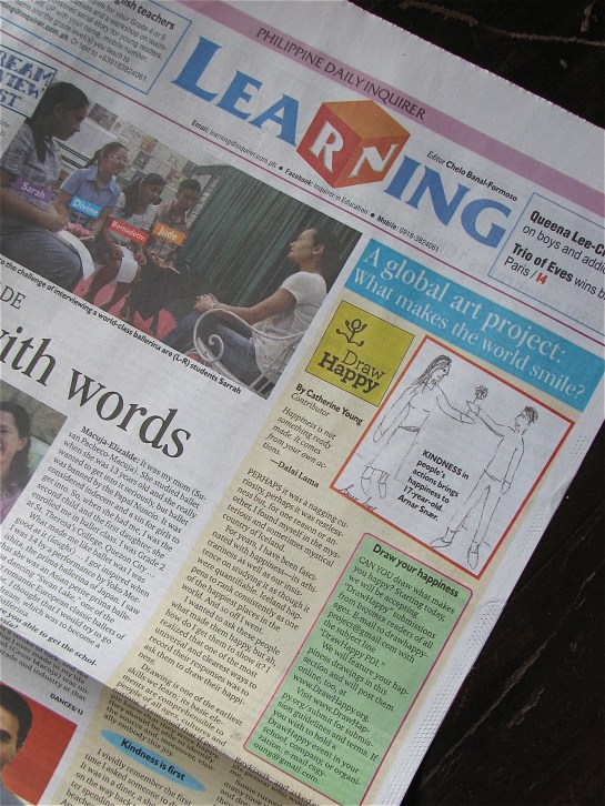
DrawHappy in the Philippine Daily Inquirer’s Learning section

How did this happen? Last week, I had coffee with my former editor, whom I hadn’t seen in eight years and who now runs the Learning section. She was kind enough to listen to the projects I am running. That was on a Wednesday; my first article ran five days later. I have been through enough to be grateful for paths of least resistance. It’s pretty much the same routine of me looking at all submissions, except that whatever I send to my editor will exist in print first, then this blog.

Why this newspaper? Well, I used to write for them. While I was rarely in their offices—the consequence of the Internet—I did meet my editor, the president, and the chairperson once, and they’re quite lovely people whom I respect. I have quite fond memories of assignments involving me as a zookeeper, a magician’s assistant, a mascot, a sushi chef, as well as the requisite book and movie reviews. The Philippine Daily Inquirer also has the widest readership in the Philippines. Because it exists in print as well as online media, I hope my projects reach even those who can’t afford technology.

Back in the day, I was what they would call a youth correspondent, and I was just out of high school. (No need for gasps of ageist-related awe; there were people younger than I was, and trust me, the differences in depth of writing among them were vast.) During college I wrote over 100 articles until I moved to New York.

I am very thankful for those years with the Inquirer because it taught me to be able to write about anything with the tightest of deadlines and with the barest of writing instruments and technology. It has taught me to take criticism, hate mail, and the occasional death threat with as much poise and dignity as possible. Going back to those old articles has always made me smile and wince at the same time. What one writes when she is 29 years old is quite different when she was 17.

It’s also funny because, as someone who was always taught that writing is no way to make a living, it has been helping me pay the bills in the almost-two months I’ve been finished with my Fulbright. Back in those days, I deposited all my writing-related paychecks in a couple of local bank accounts that I promptly forgot when I left to travel. It’s not much, but hey, guess who just paid herself while she gets her projects off the ground? Oh, the irony.

Below is the article, with the link to PDI’s website here.

What Makes the World Happy

DrawHappy: A global art project on drawing your happiness

“Happiness is not something ready made. It comes from your own actions.”

—Dalai Lama

Perhaps it was a nagging curiosity, perhaps it was restlessness, but for one reason or another, I found myself in the mysterious and sometimes mystical country of Iceland. It wasn’t just the need to get away from the mania of New York City. I went there on a hunch. For years, I have been fascinated with happiness—its arbitrariness as well as our insistence on studying it as though it were quantifiable. Iceland happens to rank consistently as one of the happiest places in the world. And so off I went.

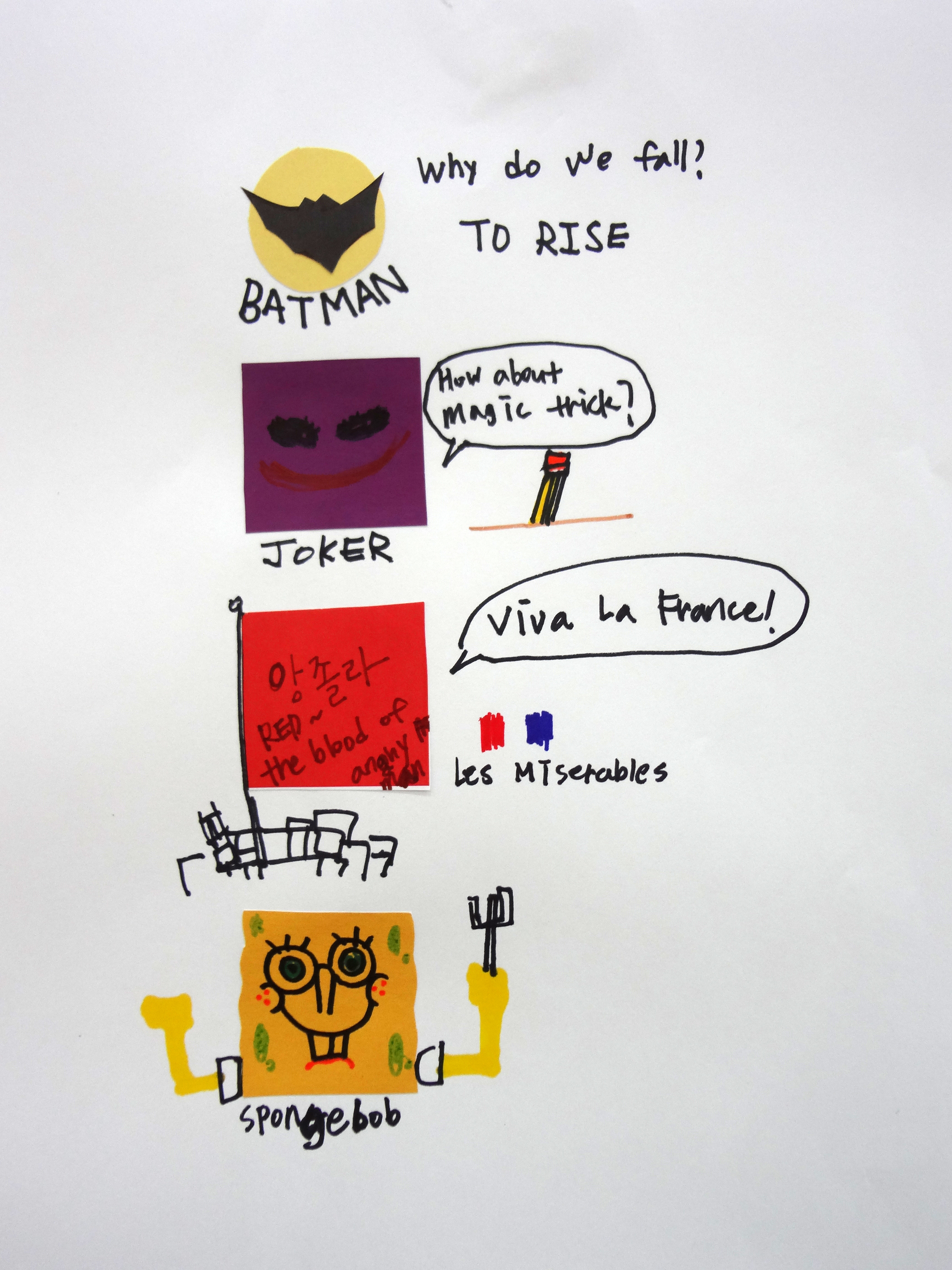
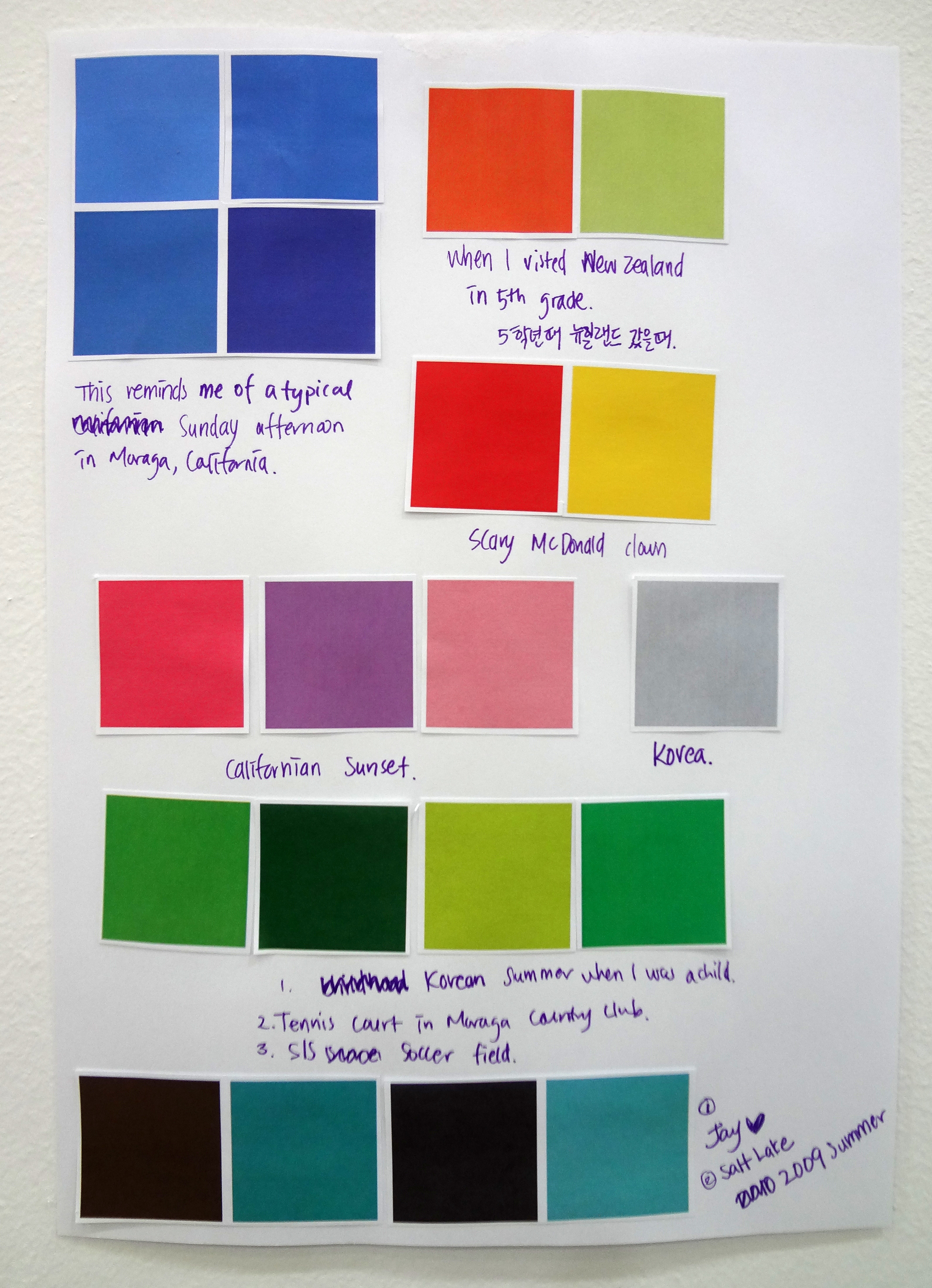
I wanted to ask these people what made them happy, but ah, how do I get them to show it? I realized that one of the most universal and clearest ways to record their responses was to ask them to draw their happiness. Drawing is one of the earliest skills we learn; its basic elements are comprehensible to people of all ages, cultures, and nations. I reasoned that if people knew that they were happy, they should be able to identify the source and moreover, visually embody this joy.

Kindness is first

I vividly remember the first time I asked someone to draw. It was in a diner, a short pit stop on the way back to Reykjavik after spending time in the black beaches of Vik. The young man, Arnar, who worked the register and couldn’t be more than 17 years old, was such a warm an genuine character that I knew I had to ask him.

When you have a project in your head, the initial step is always one of uncertainty and awkwardness. I didn’t have a name for the project yet. I felt foolish for even asking. But I was immensely touched when he drew something that I never thought would be the first sketch. “When I see people do an act of kindness, that makes me feel truly happy,” he said. Kindness! In a world that’s often depicted as materialistic and disconnected! Perhaps there was something to this after all.

A one-woman happiness machine

That first encounter made it easier for the succeeding ones. I became a one-woman happiness machine right afterwards, asking everyone in my path. Even a particularly cold and windy day (in Iceland, “windy” means “being swept off your feet”) didn’t stop me—I went through the entire street of Laugavegur, the primary commercial street in Reykjavik, and asked every single person who would listen to me. Some turned me away, but many took my offered pencil and drew, which they confessed they hadn’t done in years. Some told me that no one ever asked them this question before, which made me do a double-take (Seriously?) and a cartwheel (Yes! About time!).

I set my goal for the Iceland trip to 100 drawings, a big yet manageable number since my trip lasted around two weeks, with half of the time spent chasing waterfalls, volcanoes, and the Northern Lights. But I persisted, even asking people on the plane with me en route to New York. Upon returning, I reviewed the sketches I had, reflected on why I was even interested in doing this to begin with, and decided to put everything online and continue the project.

Drawings as data

My teachers and classmates at the Interaction Design program at the School of Visual Arts, where I received my MFA this May, helped me a lot in tightening up my story and clarifying my intentions with DrawHappy. A final project for my Data Visualization class led to me creating an infographic about the sketches I had. I began treating the drawings as actual data, categorizing the countries where people came from and what they drew. I think doing this helped me understand why people chose to draw what they did.

Until now, I ask people to give their name, age, country of origin, and profession. They don’t have to, but I encourage it because I think it’s important to own up to your happiness and it gives me a way to see how it is defined by people of their demographic. I also ask them about what they were doing right before they made the drawing; I think our notion of happiness is contextual and affected by the things that surround us. How a person views happiness also changes through time, and occasionally, I get another submission from a previous participant, whose definition of happy has evolved.

Going global

It has been more than a year since Iceland. The project has since received submissions from 47 countries. Even now, my heart would skip a beat every time I get an email from a complete stranger, wanting to participate in the project. I have smiled, laughed, wondered at, and cried at the stories I have gotten from people I may never meet. DrawHappy has been a window into our shared humanity, one that is universal and timeless. I hope to run this project forever; I think it has sustained me as well as the people who have supported it.

Lessons on happiness

DrawHappy has also made me understand happiness in a deeper way. Happiness is a paradox. To quantify it, as I have found, is less interesting to me than to qualify it by what people have chosen to draw. Happiness is also a way of life, not an end. How we are happy, that is, whether we can see the little joys in the day, matters more than the bigger payoffs of life. Finally, I now believe that happiness is something that can be cultivated or practiced every single day. I hope that in getting people to draw, they will be reminded of their happiness and that they take steps to pursue it.

Parts of this article have appeared in the project’s site, http://www.DrawHappy.org as well as my personal blog, http://www.ThePerceptionalist.com. Follow the project at http://www.DrawHappy.org or @idrawhappy.

Starting today, we will be accepting DrawHappy submissions from all PDI readers! Visit http://www.DrawHappy.org/submit for submission guidelines  and terms, and email drawhappyproject@gmail.com with the subject line “DrawHappy PDI.” We will feature a drawing every week in Inquirer Learning, and will post them online at http://www.DrawHappy.org. If you wish to hold a DrawHappy event in your school, company, or organization, please email me as well.

There is nothing like a heatwave that will make you wonder about things that are cold. Seriously, with some of the warmest temperatures hitting North America, it’s time to think about natural structures that will likely disappear in time. Here are two of my favorite artists and their pieces on ice:

1. Camille Seaman

In her project, “The Last Iceberg,” photographer Camille Seaman captures breathtaking portraits of these colossal structures. “They are like humans in that each one reacts to its environment and its circumstances in its own way,” says the 42-year-old artist in an interview with the New York Times. “There’s a sadness to them.”

I think they’re hauntingly beautiful; it feels like they’ve been around forever and have the history of the earth etched on their faces.

Svalbard, 2008. Image copyright by Camille Seaman via NYTimes

(via NYTimes)

2. Katie Paterson

One of my favorite artists, Katie Paterson, has a lovely piece called “Langjökull, Snæfellsjökull, Solheimajökull.” These are the names of three Icelandic glaciers from which she obtained sound recordings, pressed them into three records, cast, frozen with meltwater from each of the glaciers, and played until melted.

Langjökull, Snæfellsjökull, Solheimajökull. Image copyright by Katie Paterson via the artist’s website.

I’m so happy artists are able to create these beautiful pieces that sadly may outlast their subjects. While you’re at it, check out Project Pressure, an organization that aims to document the world’s changing glaciers.  (via The Guardian)

You know you’re home when old projects haunt you like spirits.

While my work is primarily about the “intersections of science and art,” I do, from time to time, do design work for things I care a lot about. Here are two of them that have appeared on my radar, physically and online, almost as if to say, “Hi! Remember me? Look at me now!”

It’s as though they were orphans I raised and gave to caring homes.

So, here are the children I gave away:

1. A logo for the Philippine Taekwondo Association 

As my friends and colleagues know, taekwondo is something that’s really important to me, but not in a competitive way. I think it has helped me a lot personally and professionally. I wanted to give back, not through competing (which I assure you, does not suit me) but through something else—design. Around 2008, I reached out to my old teacher, Coach Jobet Morales, a former medalist and currently the Philippines’ national coach, who said that coincidentally, they needed a new logo. I already had something in mind, but I also met with Coach Morales and Grandmaster Sun Chong Hong who discussed what they needed. (I remember that day! It was lunchtime and I thought that being with these two black belts was the safest place in the world. We had Korean bibimbap.)

The logo they approved has the association’s initials, rendered in the colors of the Philippine flag. The blue letter has the profile of a bird, symbolic of the Philippine eagle. The red letter is a roundhouse kick, which was a compromise because I initially suggested a side kick (better suited with the T shape), though was told that roundhouse kicks were more frequent in taekwondo (actually, true). The yellow letter has a sun from the Philippine flag.

Now it’s 2012 and, training at the central taekwondo headquarters in Manila, I keep seeing it all the time. On certificates, belts, chest guards, banners, etc. It’s quite an honor, and I’m thrilled they’re still using it.

2. A poster for Carlos Celdran’s Intramuros tour

My friend Carlos, who does these awesome tours in Manila, tagged me on this photo emailed to him by some European tourists and newlyweds. The poster on the right was my first graphic design poster, which Carlos gives away on his tours. I did this around the same time as the taekwondo project, and both remain among the graphic design projects closest to my heart. What he has done for the Philippines is fantastic, and while his tours are primarily performance art, it has contributed to the discourse of critical issues in the country.

(To the people in this photo, shoot me an email if you’d like to be identified. And thank you so much! You made my day. Oh, and congrats!)

A Disclaimer

I did these projects without any graphic design education at the time. The only things I had experience in were molecular biology and journalism. I was just a girl with a curiosity for Adobe Illustrator and a thing about “making the world a better place.” Years have passed and I’m done with an art residency and an MFA in Interaction Design, and looking at back at these projects made me both smile at the exuberance of youth and cringe at some tiny mistakes. (The kerning! Rats. I need to fix that.) But my friends / clients still seem happy about them, so I suppose that’s what counts. That brief time I was in Manila, I just loved their work and what they’ve done for me, and I thought that this was the best way to help them out. I may never be in the Olympics or Games of any sort, but at least my logo will! And helping cultural gems like Carlos’s work is something that’s always rewarding to do.

I have a cold. And this is probably why I’m sentimental.